Turner Classic Movies’ The Jolly Frolics Collection just arrived, and my brain is buzzing from seeing these on my new Blu-Ray player. This will be another of my infrequent and extremely long posts, so please bear with me.
This TCM-exclusive set covers the entirety of UPA’s non-Mister Magoo output in the theatrical short arena, spanning the entire decade of the 1950s. I make no claims to be an expert on the UPA studio, but they strongly command my attention given their place in the history of animation and their employment of several former Warner, MGM, Disney, and Lantz artists and writers. Mark Mayerson has written a short post that perfectly sums up why the studio and its films were important here.
I still haven’t read Adam Abraham’s When Magoo Flew, but I have a copy on its way to me (and I should finish writing my own stupid book before I start reading others). For now, the chapter on UPA in Mike Barrier’s Hollywood Cartoons is the most substantial piece written on the studio to date. Quite jarring actually, considering that the best passages in the book are where Barrier’s passion and interest are strongest (Walt Disney, Bob Clampett, Chuck Jones), which is certainly not the case with UPA.
To sum up TCM’s actual presentation, it’s superb. The packaging is elegantly designed and decorated with UPA artwork and comes with a booklet to tell you where to find everything. The restorations are nothing short of brilliant, and easily the best I’ve seen done on a major release outside of the Walt Disney Treasures and Looney Tunes Golden Collections.
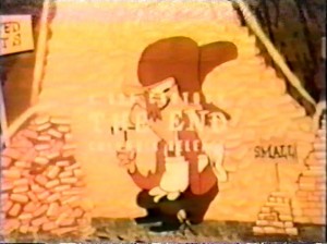
My only reservation is that I wish more care had been taken to seek out the original end titles to these things. Columbia was the most unpredictable and careless of all the studios when they reissued cartoons. Most of the Screen Gems cartoons had their front titles stripped off completely, whereas a few later ones retain the original opening but have a generic “Columbia Favorite” end title.
That generic end title is what we see on a great number of the cartoons on this set. In UPA’s case, the replacement cuts into actual animation, dialog, and action, so it’s quite a jarring transition to see the jump cut. Tis a shame, because a great many of them do exist with their original end logos. This is by no means a deal-breaker – everything else is intact, there are a few titles (Robin Hoodlum, The Tell-Tale Heart) I had never seen before, and they all look brilliant. I will gladly trade the end titles for the body of the film so lavishly remastered.
The reissue titles are quite amusing, as it’s a reminder of how Columbia lumped in these works with the reissues of the very different cartoons by Ben Harrison, Manny Gould, Charles Mintz, and others. It also reminds me that in order to fully appreciate UPA, you can’t watch them while they’re amongst themselves. Rather, you should play the very best of UPA along side of the very best of the other Golden Age studios. This exemplifies the individuality of UPA and the other studios, and also how wonderful a medium can be that allows so many different approaches to filmmaking.
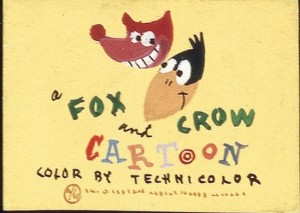
To get a distribution deal with Columbia, UPA had to agree to use the former Screen Gems stars, Fauntleroy Fox and Crawford Crow. This trio of shorts directed by Hubley are inseparable from the best of the ones Screen Gems did – uneven, but an endearing unevenness. The Fox and Crow in Hubley’s The Magic Fluke are no more clearly defined than the Fox and Crow in Alex Lovy’s Grape Nutty (a holdover from the Screen Gems studio, also released in 1949).
There’s nothing exactly ‘new’ about them either. They are strikingly similar to Jones’s experiments with stylization with relatively full animation. Take the exchange between Fauntleroy and the King in Punchy De Leon (animated by Bill Melendez). It pays succinct attention to lip sync and broad, funny movement. The only separation between this and the Jones cartoons is that the former is drawn marginally flatter. It’s an elegant and smart approach. Hubley is easing theatergoers and those picking up the dime for these cartoons into accepting bolder graphic statements by not disregarding what makes character animation so rich.
The first Mr. Magoo cartoon, Ragtime Bear, is much in the same mold. It’s the only Magoo included, so Hubley’s real knack for characterization is not on full display. (For completeness’s sake, they should have also included the far funnier Spellbound Hound, the second Magoo released under the Jolly Frolics banner.) The character is a gem in these early shorts to be sure, walking around bantering ala Popeye, wreaking havoc all while being a charismatic asshole to the unfortunate folk who get in his way.Magoo was well-recognized inside UPA as their sell-out series, for sure, but if they were inept at creating likable, humorous personalities, the character would never have caught on. With that in mind, be sure to get a copy of the Magoo set that’s forthcoming in June, so you’ll have the complete UPA library. (Though like with this set, almost all of the cartoons worth repeated viewings are confined to the first disc.)
Bobe Cannon was one of animation’s most puzzling treasures. He came up through the ranks at Schlesinger’s and is said to have been critically involved with the concept of smear animation with Chuck Jones. He ultimately abandoned all of what was fun in his own animation in the cartoons he directed at UPA. There are still traces of it in The Miner’s Daughter and Georgie and the Dragon, and Cannon and Paul Julian (one of the studio’s real unsung heroes) also helmed Wonder Gloves, a vastly underrated cartoon with simple but highly pleasing design and animation.Cannon’s Oscar-winning triumph Gerald McBoing Boing is a real curiosity to me. The cartoon is among one of the best ever made, no doubt, but what did Ted Geisel think about it? There is clear disdain for Geisel’s own art style; the cartoon looks absolutely nothing like his work. Quite odd, given the great lengths UPA would go to preserving the art styles of far lesser draftsmen than Geisel later on. Clearly it has more in common with Disney’s adaptations of children’s stories that sacrificed the original’s earmarks in favor of what the filmmakers considered compelling filmmaking. Not to its detriment at all – as those are great Disney cartoons, Gerald is a great UPA cartoon. If it’s a great Dr. Seuss cartoon you want, watch Bob Clampett, Chuck Jones, Hawley Pratt, and even Ralph Bakshi’s adaptations.
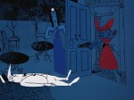
Rooty Toot Toot‘s significance needs no explanation. If you’ve put off seeing it, you have no excuse not to now. Foreshadowing certain thematic and story elements of Billy Wilder’s Witness for the Prosecution, it’s an animated musical comedy with a murder at its centerpiece, with strong graphic design reinforced by equally powerful animation. As the comments on this post will likely prove, opinions on the individual UPA cartoons are very divided. If there’s one cartoon that everyone agrees is perfect, though, Rooty Toot Toot is it.Not all is roses in the Hubley era. Art Babbitt may have been a catalyst for UPA with his role in the Disney strike, but his shorts Giddyap and The Popcorn Story are wholly mediocre and bear none of the earmarks in animation or design that UPA became deified for. Only a hallucination sequence in Babbitt’s Family Circus fits under the accepted house style; that short segment is drawn, colored, in a purposefully crude, stick-figure style, as if a child did. Such was considered revolutionary at the time. Such a thought, of course, is false.
This is probably why the pretension surrounding the celebration of UPA irks me most. Their snobbish attitude is condescending and obnoxious as hell, to be sure, but you’d be surprised how many of your favorite directors at Warner, Disney, etc. hated the competition’s cartoons. Smugness is not exclusive to any one artistic approach. Yet almost all of UPA’s innovations and triumphs had been done in some small form or another elsewhere in service to full humor and satire. You would never hear the UPA alumni admit that, because the non-UPA artists did not tailor their experiments to serve design; therefore their approach is invalid.
Avery’s stick-figure art in Porky’s Preview is one of many concepts that found its way into UPA. We all know Chuck Jones’s The Dover Boys probably inspired the whole movement of using more angles in animation. It may have been the most influential cartoon of the decade, so much so that Hubley and friends stole it and did it point-for-point (with none of the laughs) as The Rocky Road to Ruin at Screen Gems.
Jones continued his experimentation with non-traditional character designs and layouts throughout the decade with his various designers. So did Shamus Culhane and Art Heinemann at Lantz. All of Frank Tashlin’s cartoons have a bolder, more graphic look than the other Warner shorts, indicative of his work as a print cartoonist, yet retaining the principles of full character animation. At his third stay at the studio, Tashlin began making things so angular that if you thickened the outlines in a cartoon like Nasty Quacks or Hare Remover, they are essentially some of UPA’s earliest efforts in look. Certainly Rod Scribner and Jim Tyer’s use of distortion in the 1940s could also be viewed as a bit of graphic daring.
Escaping the animal-violence-slapstick cognizance was not foreign to American animation either. Have the people who say that UPA was the first to break away from it not seen Fantasia? Surely they have, since most of UPA’s core crew worked on it. Not to mention sequences in Make Mine Music, Melody Time, and countless one-shots Disney did that are strictly mood pieces, done years before UPA’s invasion. This is not to mention the fresh, vibrant work of George Pal in stop-motion, which always steered away from the normal narratives in hand-drawn animation.The 1960s saw all kinds of innovations in moviemaking in both Europe and America, and you’d be hard-pressed to hear the directors of those films claim they weren’t inspired by any films done beforehand, pompously stating their ideas fell out of the sky or from a ‘higher’ art form. What UPA ultimately did was not bring modern design and unconventional concepts to animation, but push things far enough to make us as viewers absolutely aware that we’re seeing modern design and unconventional concepts. That Bugs Bunny or Woody Woodpecker might have been at the root of this, however, is still sacrilege.
Barrier writes that Hubley’s “ghost” sort of haunted the studio, yet his influence is scant in the films made at UPA after he left. The exceptional post-Hubley UPA cartoons are few and far between. Cannon’s Christopher Crumpet has grown on me over the years, having once thoroughly despised it.
The height of UPA’s pretension may be Unicorn in the Garden. Like the far worse Madeline, UPA did not add anything to this animated adaptation. If there is any charm or humor to the cartoon, it comes from an outside source, in this case, the actual words and art in one of James Thurber’s least inspired short stories. It’s hard to believe that a film and story so predictable and juvenilely misogynistic can be hailed as sophisticated by liberal artistes. Tex Avery and Famous Studios always had nagging housewives blown up and received no accolades. If they really wanted to be bold, UPA should have adapted Thurber’s “The Owl Who Was God” to animation. But that, of course, would have involved talking animals and baiting HUAC further.Accepted as one of the best, of course, is The Tell-Tale Heart, a film I wish I liked more than I did, considering that the elements for perfection are all in place (especially James Mason’s narration). It’s a short that could have benefited from a longer length. Edgar Allen Poe is one literary master whose work should not be compressed when adapted to film. The film spends most of its time building up to the murder, shoehorning the madman’s psychological trauma into the remaining time. It’s at least a respectful adaptation of Poe, if not an ideal one.
No other UPA cartoons after The Tell-Tale Heart dare go into uncharted territories. What you begin to see in almost all of the cartoons past the first disc is pure design, with all other elements subservient to it. Bobe Cannon admitted as much after Gerald McBoing Boing won an Oscar. “We made a cartoon that is frankly a drawing,” Cannon said. “You never think of Mickey Mouse as a drawing. To audiences he’s a real little character.”That is, of course, untrue, considering that if Gerald wasn’t an engaging character, nobody would have liked the cartoon. There is something more going on in Gerald and Rooty Toot Toot, and that is real character animation, however different in look and approach from Mickey Mouse it is.
UPA quickly went into a decline with this “drawings” philosophy in mind. Like the studios they influenced, character animation was completely abandoned in favor of bad animation, plain and simple. Intellectuals be damned, it is far easier and cheaper to fake the modern design that UPA championed than the traditional, “nineteenth century” look of a Warner cartoon or Disney feature. There was no mistaking a 1945 Terrytoon for someone else’s, but would the non-initiated be able to differentiate Tom Terrific or Sick Sidney from UPA?
In spite of what critics and peculiar cliques want people to believe, there was absolutely nothing groundbreaking about the UPA style and brand in its later years, and nothing to recommend their individual cartoons either.The other studios had quickly caught up in updating their designs and layouts to match the UPA style, often times doing it better than UPA themselves. As this happened, UPA found itself falling into the very cliches they openly reviled. Their sneering at conflict produced cartoons as boring and vapid as anyone’s. What is The Emperor’s New Clothes other than a trussed up Jack Hannah/Charles Nichols Disney cartoon, done just as lamely? Is The Rise of Duton Lang really a higher being than the dozens of other cartoons with a pointless story told by a charlatan narrator? As much as I like The Man on the Flying Trapeze, it’s nothing more than The Dover Boys with a facelift and on valium.
UPA became derivative of not just other studios, but of themselves. Christopher Crumpet’s Playmate is nothing on the original, nor are the three later McBoing Boings Cannon promised the public they would never see. Magoo became just another reoccurring character whose cartoons stretched one joke to the point of no return, and more or less became dreary monologues for Jim Backus. UPA was now just another bland cartoon outfit, inseparable from the rest except in name.
As history stands, UPA was another “new kid” in town, enjoying the same perks and fate the other American studios did. Like with Disney and Warners before, like Spumco and Pixar after it, what UPA got right was inspirational and in some ways unsurpassed. They became not an influence, but an industry standard. That standard turned to formula, which predictably involves some studios “getting it” better than the original with their imitations. Most other studios just parroted the original’s bad traits, and soon those faults permeated the genuine article. Ad nauseam.
If there is a sadder, more cyclic artform than the animated cartoon, I know not of it. Perhaps since I’m so adverse and skeptical to UPA on principle that these viewings made me more aware of this pattern whereas lesser classic studios just fill me with joy. But there is quite a bit of real joy on TCM’s Jolly Frolics Collection, the kind that makes you fully aware that the animated cartoon can also be the most satisfying use and celebration of the arts and sciences. I urge anyone with a serious interest in animation’s history and potential to purchase the set.




Just read your UPA piece, which I enjoyed. I think you misconstrued my “ghost” comment about Hubley in Hollywood Cartoons, though. The idea was—as I think you’ll see if you re-read those passages—not that anyone was trying to emulate Hubley, but that Hubley’s films were a silent critique of the sludge that oozed out of the studio after Hubley left. Thus Lew Keller’s comment that “Hubley was a terrible lacerating memory” to Cannon. Or maybe I didn’t make that as clear as I should have.
Since it seems like only ONE disc is worth looking at, I just wish there was a “Best of UPA” DVD.
There’s an entertainment world cultural phenomenon best described as “Too Successful To Fail” that can either be linked to things that are either wildly popular among the masses and/or the critics due to their initial efforts, to the point that declining later efforts are treated as on par with the initial work until well after the fact, when critics or the masses can finally admit to themselves and each other what was peddled as gold was actually brass.
The UPA efforts fall into that category, which is why Jolly Frolics is going to be one of those DVD releases where you hope Disc 1 is made of sturdier components than Disc 2. What attracted the critical praise and the box office success was both the radical departure in design, combined with stories that used those designs. By the mid-50s (and even on into the 60s after the studio had for all intents and purposes closed), UPA was still receiving praise even though the stories were trite or sparse on plot, but they weren’t Disney, Warners or MGM style cartoon, and in the minds of many of the critics, that was more important than actually entertaining the audience (though apparently not to the theater owners booking the shorts or Columbia, or they wouldn’t have dumped UPA for the high-concept insipidness of Loopy de Loop in 1959).
The ongoing huzzahs for UPA by People Who Mattered meant UPA was freer to go their own way, even when going their own way meant cartoons that looked unique, but offered little else for the average moviegoer. Say what you want about the late 50s Terrytoons or even Paramount’s one-shots and their efforts to mimic UPA; at least they were trying to offer more aggressive storylines that had proven their worth over the previous 20 years (and which UPA had done in the late 40s and early 50s). UPA’s fall ironically ended up mirroring the problem with the post “Lion King” 2-D features from Disney in that the success over a 4-5 year period convinced too many people that story didn’t matter, and anything they threw up on the screen was going to delight the critics and rake in the audience.
Nice piece and it’s far different in tone (and for my mind more interesting)than the UPA piece you wrote years back on your old blog (critical but without dissolving into a rant). I don’t when I’ll be able to dive into this set but at least I know that I own a good copy of “Rooty Toot Toot” (now if only a complete Avery and the early non-popeye Fleischer cartoon were also in the works).
I don’t quite agree with Fantasia not being considered ostentatious, but that doesn’t change your orginial point any way.
I’ll be honest though, while Hubley staying longer might have improved UPA’s output but it’s also possible Hubley himself might have fallen into line with his co-workers in terms of making dull shorts. After all, whatever one thinks of the “Moonbird”, there’s no denying (in my mind) that it’s a step down from “Rooty Toot Toot”.
Michael – I reread those passages and I don’t think I misconstrued them, though what I’ve written makes it appear I did.
Paul – Yeah, well, one should be a better writer and thinker than he was when he was 16. I couldn’t disagree more about “Moonbird”, though. It has intellect and point to it that just isn’t present in the UPA “kids pics” of post-53. It is amazing that Cannon went to work for him again if Hubley’s presence at UPA truly disturbed him.
The critics’ love of UPA was a real daunting obstacle in getting Warner and Fleischer the respect they deserved; Bob Clampett would make his name first with Beany and Cecil, and Jones and Avery wouldn’t really get any creative recognition until the 1970’s.
After seeing so many modern cartoons that attempt to follow UPA’s lead on design and wind up with jumbles of indecipherable polygons, seeing the real thing should be a treat. I’m still waiting on my set.
That’s a really fine review, Thad. But does it matter that your player was Blu-Ray when the DVDs are not?
Not really, just stating that I finally made the jump.
To consider the proverbial UPA style strictly in terms of precedents in animation history alone (Dover Boys, etc.) is wanting and quite a narrow scope for your analysis, as it disregards the increasing popularity of Modernist Aesthetics away from European salons and finally into the broader American public. Such would begin to dominate all aspects of industrial design. The artists of UPA, as well as Jones, doubtless derived their enthusiasm for the ‘new style’ on the momentum created in art institutions for modernist painting and architecture. This piece seems more a revisiting (and an invested and sensitive revisiting, no less) than a revision of the received wisdom of animation history.
There is no disregarding modernism’s increasing popularity and influence in this piece. It’s implied by the fact that the seeds of UPA were permeating studios before UPA existed. Though I will grant you mentioning modernism’s increasing presence in America in plainer terms would have been useful, yes. But I am a film student first and foremost and would rather discuss the films themselves than the non-film art that provided influence at length, getting abstract and playing games with the thesaurus. Though our opinions on UPA differ greatly, it seems the same goes for Amid Amidi and Adam Abraham.
It seems ridiculous to attribute the stylistic turn in animation to Chuck Jones and/or UPA without attributing it to a cultural phenomena that is beyond them, and clearly responsible for the change. There is nothing disingenuous or of gamesmanship in this. As a student of film, you must consider Leger’s Ballet Mechanique and the abstract geometric animated films of Hans Richter, both of whom have a direct relation to the avant-garde and modernist painting, as well as early film and animation.
We’d all like to encompass everything possible in our writings, but sometimes stuff’s gotta go or you risk disengaging the reader. Do you fault writings on Warners for not acknowledging screen actors and writers that clearly influenced the work in a non-tacit manner? Kirk, why not write a piece yourself and show how it’s done? A piece on strictly modernist art’s influence on American animation and nothing about the films or their people/merits. No sarcasm intended in this suggestion. It’d be a useful piece.
A good suggestion, and I appreciate your forbearance. There is evidence of my attempt to make connections between the two here and there, but I haven’t demonstrated the rigor.
Great review Thad! I have to buy this DVD whenever I get the money to do so. I love early UPA and the design sense behind these shorts. It’s a shame people like Bobe Cannon abandoned their cartoony roots to produce pretentious garbage later on.
Do you mind if I email you about some important matters? Thanks!
Sure, Roberto, you can e-mail me, you can find my contact info on my “About” page.
I have a minor (yet significant) correction to add to your thought-provoking piece. Hubley and friends did not steal Dover Boys point-by-point. John McLeish, the same guy who conceived and designed “Dover Boys”, redid the cartoon at Screen Gems. The sequence of production on these two films require further research, and McLeish’s motivations for making two versions of the same film are hazy, but it’s not a cut-and-dry case of one director copying the other.
Amid, I know McLeish worked on both pictures. Perhaps I was too hasty to call it a ripoff, but when I first saw the cartoon five years ago, I was beyond disturbed by its similarities to the Jones cartoon, and I may not have quite overcome it. It’s a shame nobody interviewed McLeish (or did they?). Please do let us know if you find anything conclusive. I’d really like to see that one restored, as even my 16mm film print is from fading elements.
It’s obvious that UPA paved the way for the ultra-cheap Saturday morning productions that almost killed animation as an art form, but if one could step back in time, and ponder just the first of their efforts (“Robin Hoodlum”), it’s clear that it is not merely design-oriented, as you say, but also, as fully-animated as it needs to be. The characters are exceedingly well-defined in movement, particularly the fox, who gads about with an airy insouciance. There’s a lightness, a sparkle to it that extends to the design and color schemes as well, a refreshing attempt at sophistication that no doubt was exhilarating then, and still seems so today.
The cheerleading from some quarters regarding UPA “firsts” also extends to John Hubley having given screen credit to a black composer – Phil Moore. Now, as is well known, 20 years prior to this Fleischer showed actual footage of Cab Calloway – and others – during the opening credits of cartoons in which his songs were utilized. I suppose if you define “composing” a “score” narrowly enough, UPA can claim a first on this one, but the reference to it clearly means to imply much more than a technical first.
Do I detect a feeling of resentment towards UPA (among animation buffs, anyway) – a feeling that somehow its accolades are undeserved. It may be true that the studio’s much lauded innovations are nothing new; but, to paraphrase Arturo Toscanini in discussing Wagner’s “Lohengrin” – there’s nothing new here, except for the way it’s put together. That’s UPA – nothing intrinsically new, but put together in a way that tells you this is not your run-of-the-mill Looney Tune.
How many of you grew up in the ’50s? You’ll remember before UPA, only the Disney animated features had any cache. I’d occasionally hear a word of praise (from my parents) for Gerald McBoing Boing, or the odd item like “The Dot and the Line,” even Huckleberry Hound. Donald Duck, with his funny voice, would occasionally raise a good-natured chuckle, but Warners’ and their ilk were anathema! Violent, stupid and silly! Every time a mallet would make contact with a noggin, or a shotgun would explode harmlessly in someone’s face, I’d get the same reaction from my folks – (e.g. “that’s not funny” or (“don’t try that on your brother,” etc…) That the best of this stuff, like the best of the Stooges (also, universally reviled) was brilliant, didn’t occur to anyone. In comparison, UPA was the only standard bearer of adult, ‘artistic’ animation, designed for folks, who, like my folks, didn’t like ‘cartoons.’
It’s funny, but I was conversing with a friend recently, and he agreed with my dismissal of Unicorn in the Garden, calling it exactly that – “one of those cartoons for people who don’t like cartoons.”
It’s interesting that long after UPA had closed and its theatrical films were not generally being shown, the critical acclaim the studio had received in the 1950s continued to manifest itself in what was by then the popular view that Disney had received far too much credit. I recall attending a talk given by John Canemaker around the late 1970s where he said, upon fielding a leading question from a member of the audience, that it had become fashionable to be dismissive of the Disney accomplishments, though Canemaker himself refused to do so. The continued resentment toward Disney was at least understandable at a time when many key figures in the development of the art form were still wallowing in relative obscurity to all save those who had worked in the field or had ready access to academic journals on the subject. But with the plethora of popular books on the American animated cartoon that soon followed, as well as the documentary materials present in the home video market, the artists outside the Disney fold have now to a great extent received their due. The criticism of UPA today, then, may simply be a case of bringing some overall balance to the picture of its impressive accomplishments, the exaggeration of which was in part fanned by those who worked there. Indeed, the praise at times was positively Arthurian. Consider a comment by story man Leo Salkin: “if God were merciful, UPA would have survived.” I think a little perspective was needed there.
While the studio’s influence was great, Michael Barrier concludes in his Hollywood Cartoons that the number of truly superb UPA cartoons is pretty small – barely a dozen.
Nevertheless, this is a very important DVD release on a number of counts and by any account, and TCM deserves accolades for making it available. It is hoped that the interest and sales it generates will serve to inspire more DVD releases of neglected animation gems.
I do admit, those re-release end credits are pretty jarring the way they pop up at the ends like that, if only more of the shorts were restored without them, the few we do get is kinda nice not having to see ’em at all.
>> To sum up TCM’s actual presentation, it’s superb. The packaging is elegantly designed
The main font in both the DVD menu and packaging is MS Comic Sans. Major design fail. Also it’s Ted Geisel, not “Geissel.”