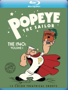
 When I wrote this post about Famous Studios Popeye cartoons earlier this year I expressed hope that restoration was around the corner. I did not think Warner Archive’s Popeye the Sailor: The 1940s Volume 1 would come so soon after, and am happy to say that a purchase is very much in order for anyone who values classic film restoration and preservation. This single disc picks up where the Popeye DVDs left off ten years ago, which finished off the black-and-white Fleischer and Famous cartoons (and the three Technicolor two-reel specials).
To truly appreciate how historic an occasion this is, a recap of how mistreated these films have been is in order. In the race for contemptible title of “most abused films”, the color Popeye cartoons may be the winner. When both the Fleischer and Famous Popeye cartoons were sold to A.A.P. for television in 1956, the Paramount logos had to be removed from the beginning and end (as per the agreement). In the case of the color films, this also caused a serious corruption of the soundtracks, with generic A.A.P. slugs spliced on (with the track from 1948’s Olive Oyl for President), causing abrupt cuts and distortions to each cartoon’s opening and closing. (Miraculously, the Fleischer cartoons didn’t suffer soundtrack losses. Why, I don’t know.)
Fortunately none of the materials were destroyed (and they very well could’ve been, given the normal arrangement with King Features licensees was that the materials were to be destroyed ten years after the original release; hence why the Barney Google cartoons made at Mintz are now lost), but it took until the early 2000s for any kind of serious reconstruction to happen with Barry Mills’ The Popeye Show for Cartoon Network. The black-and-white Popeye cartoons got an upgrade in 2007-08 with the admirable mass market DVD sets. Those aren’t all they could be (and they couldn’t be, being largely sourced from TV materials), but they at least were largely accurate representations of the original films (with a few exceptions, most notably Organ Grinder’s Swing with the wrong credits), which is all that matters.
 While it’s accepted wisdom that Popeye never amounted to anything after the Fleischers’ names were gone, there is definitely much love, nostalgia, whatever you want to call it for the cartoons bearing Famous Studios’ logo, and everyone has been curious for some ten years now what Warners would do with them. The one benefit for the black-and-white cartoons was not only did they retain the original soundtracks on TV, they were in black-and-white – no color fading. A.A.P. did everything on Eastman stock, and subsequent owner Turner did nothing to rectify this in the ’80s. They could have, seeing as they did use better, more colorful elements on the Warner cartoons they also owned.

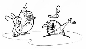
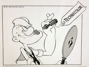
Drawing from Paramount Sales News, April 29 1943 edition.
But Popeye was just Popeye, which proved to be yet a further disservice to the Famous cartoons, because if there’s one thing they did right, it was color. Artists like Anton Loeb and Bob Little perfected “scenics” at the Fleischers’ and carried over the same deftness when Popeye went to full Technicolor, something viewers have been unable to appreciate for some seventy years now. I’m still working with Charlie Judkins on a full history of the New York animation studios, but I’ve already written at length for Jerry Beck’s Cartoon Research about how these films were made and marketed. As a I reiterated constantly in that column, the lack of energy in the Paramount Sales News pitches slacked off when the energy in the cartoons did same.
But energetic they were in those first two years, and that’s what Warner Archive has released. Restored from the original negatives with the original titles, credits, and soundtracks reinstated; the original colors and actual film-look (none of that Disney revisionism); no DVNR to speak of; all done in the new 4K workflow that no other Warner-owned animation has experienced. Oh how I wish this was what launched the initiative for more classic animation on home video through the Warner Archive program!
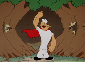
The color is what will be praised most about the restorations, and it should be, as the TV transfers’ color was absolutely trashed for years on most of them due to Eastman fading. So much so that the new Blu-Ray version makes them unrecognizable and practically new films. Her Honor the Mare, the first Popeye one-reeler in color, looks more like one of the Fleischer Color Classics than anything that followed at Famous; The Marry-Go-Round, W’ere On Our Way to Rio, Anvil Chorus Girl, Moving Aweigh, Pop-Pie Ala Mode and For Better or Nurse no longer have their “limited palette” look and match surviving 35mm Technicolor positive elements I’ve seen or owned. Admittedly, I was a little nervous that these restorations might follow the lead of the Warner restorations in 2012-14 that crushed the levels and wrecked detail, but happily such is not the case. It’s also wonderful to have the original soundtracks (mostly) reinstated. Winston Sharples, while not in the same league as Carl Stalling or Scott Bradley, was a gifted composer who also utilized the studio’s pop music library to its fullest extent. His arrangements also often carried through the iris out to the Paramount mountain, so it’s a revelation finally having them fully intact after so long.


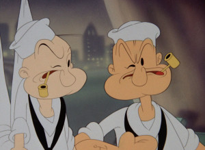
There is at least one irritating error: the soundtrack for For Better or Nurse was taken from the A.A.P. copy, so the abrupt splices are still intact, the track is dead for most of the title card, and the track for the closing music is completely wrong as it was on TV. Strange something this obvious wasn’t flagged in Q.C., but this falls in the category of “human error” and isn’t a deal-breaker. The picture restoration, as said (and seen) above, is still truly stunning. (Though I have a 16mm print of For Better or Nurse with the original titles and soundtrack that I’d have gladly loaned had anyone asked.) [12/14 update: Jerry Beck writes in the comments that the A.A.P. track was the only one they could locate in the vaults.] The soundtrack for The Anvil Chorus Girl, while wholly intact, is also severely distorted, another questionable gaffe, but it’s still survivable.
Famous is an endlessly fascinating topic for me, so the proper presentation and restoration really allows one to appreciate the history as well as enjoy the entertainment. Everything that went right at Famous, where the cartoons could’ve gone, and where they unfortunately did, is present in this set. It’s a transitionary period with many earmarks of the old Fleischer drawing style melding with fuller, “traditional” Hollywood-influenced animation. Two animators in particular, Jim Tyer and John Gentilella, have much of their finest work featured. (Hopefully bonus features will be reinstated on a second volume, so these two will get due recognition for their contributions to the series and the character.) It’s long been settled Hollywood methodology couldn’t be replicated in New York, but these earlier cartoons show that Famous could’ve made satisfying cartoons of a unique flavor had things gone differently.
This is the best that Famous has to offer, so if you like these, you’ll want to purchase the Popeyes at least through the next few years’ worth.
The highlights and lowlights…
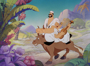
 Her Honor the Mare – Jim Tyer de-facto directs and animates on the first color Popeye one-reeler. The shorts with Popeye’s nephews rank as the least entertaining in the series, but Tyer’s direction and approach to the hideous horse make this far more endurable.
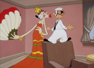
The Marry-Go-Round – Despite Popeye murdering him at the end of Happy Birthdaze, Shorty returns, this time to ruin any chance of Popeye and Olive getting hitched… since Shorty’s got more sex appeal.
W’ere On Our Way to Rio – Tyer de-facto directed and animated, with some creepy rotoscoping that was done of a dancer wearing a Popeye mascot head. Easily the winner for the most unfailingly likable of the Famous cartoons, and the most revolutionary of the restorations in terms of clarity and color.
 The Anvil Chorus Girl – The first released cartoon (though not the first one made) that marks Famous’ move back to New York from Miami. A duller remake of the earlier Shoein’ Hosses that makes up for it with a few dynamic scenes by Johnny Gent at the climax. Mae Questel voices Olive Oyl once again, and Jackson Beck voices Bluto for the first time.
Spinach Packin’ Popeye – Cheater cartoon that began the Famous tradition of slicing and dicing pieces of the Fleischer two-reelers to save the production schedule money.
Puppet Love – Another Tyer de-facto directed and animated cartoon, probably the one most reflecting his sensibilities. My personal favorite.
Pitchin’ Woo at the Zoo – A strange cartoon full of animal abuse only remarkable because Bluto unintentionally puts Olive in danger for a change.
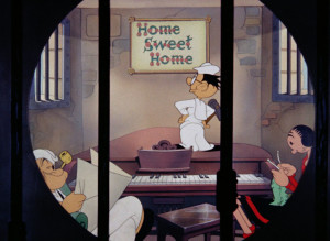
Moving Aweigh – According to Johnny Gent, the first Popeye cartoon he animated, partially directed by Dan Gordon before he was fired (alcohol), and mostly finished by Jim Tyer. The out-of-character Popeye as a stooge/foil concept did not originate at Famous, but they made it a regular lethal component of the series. The comic approach of the Tyer and Gent animation here eases the sting and makes Popeye’s abuse from Shorty, Olive, and a cop actually funny. Fifteen-year-old Arnold Stang provides his first ever voiceover as Shorty. (One thing I never noticed before was that the final iris out is actually behind bars, too.)
 She-Sick Sailors – The most popular of the Famous Popeyes and one of the best. Tyer directed but with none of his animation. Bluto as a deranged psychopath was another unfortunate development at Famous, but some inspired character development and a haunting soundtrack from Winston Sharples make this an unusually satisfying and chilling cartoon. Johnny Gent animates the entire ending, which animator and historian Bob Jaques analyzes in-depth here.
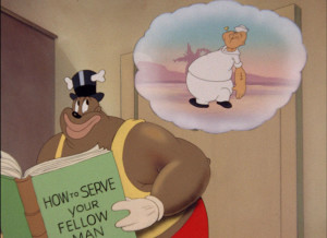
 Pop-Pie Ala Mode – The later also cannibal-centric Popeye’s Pappy is much worse, but this is still one unpleasantly racist, ugly, and unfunny cartoon. One of Jeff Sessions’ personal favorites. The “How to Serve Your Fellow Man” book predates the Twilight Zone episode of a similar name by some fifteen years.
Tops in the Big Tops – More familiar, unremarkable Popeye-Olive-Bluto triangle hijinks, but still fun.
Shape Ahoy – This one mostly gets attention as the first cartoon recorded after Jack Mercer entered the service, with what’s allegedly Mae Questel’s bizarre interpretation of the Popeye voice. (Historian Keith Scott says it might not be her; there were at least two other Mercer replacements in ten 1945-47 releases.) The actual highlight is director Jim Tyer finally returning to the full-fledged deranged form he exhibited in the black-and-white Popeye cartoons, much to the ire of his superior Seymour Kneitel. (Note how the picture is so clear you can tell that the hand model in the final shot hadn’t trimmed his nails in a while.)
For Better or Nurse – A remake of the Fleischer classic Hospitaliky, and a comparison illustrates the effect “traditional” timing had on the series. Fortunately it works because Johnny Gent was the principal animator, and the dynamic beatings in this cartoon rank as “full” as animation at Famous (or anywhere) got.
Mess Production – An amalgamation of Fleischer’s A Dream Walking and Lost and Foundry, one with a fascinatingly rhythmic approach to Olive’s unconscious stroll through a factory. (New Famous arrival Marty Taras animated the first close-up of Olive with actual breasts that asks us to ridiculously take Olive as a sexual being seriously.)
Unfortunately, the cutoff point is right before Bill Tytla started directing at Famous with two great cartoons in particular, Rocket to Mars and The Island Fling. A second volume would include those, and we’d still be a few years from when the series completely ran out of steam. I can only imagine proper restoration of the Popeyes released in Cinecolor and Polacolor (though made and timed with three-strip Technicolor in mind) would be just as enlightening, if not as entertaining, as the films here were.
I sincerely hope the Warner Archive discs continue with this care, not just for the Famous cartoons, but for all the Warner and MGM cartoons, too, because this is the last time most classic film is going to be revisited or remastered, and it’s important to do it the right way – the Popeye the Sailor: The 1940s Volume 1 way. The fallout over my harsh criticism of the highly deficient Porky Pig 101 set last year was definitely unprecedented and unexpected and I won’t comment further to aggravate feelings. What’s done is done. (Although you should definitely read the relevant paragraphs in Greg Method’s “Wideo Wabbit” history for a fair summation.) But I will say this: I am extremely happy the people at Warner Archive, specifically Jerry Beck and George Feltenstein, have ultimately proved to care more about this material than many of the acquiescent fans and deranged fringe producers who claim to champion it.
I don’t think the restored versions are going to change anyone’s minds about Famous Studios—Thunderbean Animation’s Noveltoons disc certainly didn’t—but at the very least this Warner Archive release finally allows audiences to see the color Popeye cartoons in proper context and witness a transitionary period for one of animation’s iconic characters. Let’s hope Warner Archive can continue showing these stories, and maybe even revisit the earlier sagas through more gratifying means.
