 Amidst graduating and job searching, I’ve once again neglected this blog. Not much exciting to report at all, but during my travels, I’ve drawn a few conclusions about the restorations we’ve seen of classic cartoons in the digital-video-disc era.
The one complaint I always, always see, from fans and experts alike, is how “wrong” the colors look. They’ve been pumped up, they’re too bright, the lines have been “thinned” (which I guess is a confusing way to make one of the side-effects of DVNR its own separate problem). What’s hilarious is that I almost never see someone who actually knows what they’re talking about doing the complaining.
 What I take issue with in general is that most of these guys have likely never handled film elements in any capacity, so the basis of their complaints is hollow. They’re merely saying what they think the cartoon should look like with no solid foundation for their argument.
 After handling some several hundred IB Technicolor elements going back to the 1940s (including 35mm nitrate material) it seems to me that the vast majority of the restorations of classic cartoons done in the digital era are, indeed, an accurate representation of how the films originally looked. I’ll concede that occasionally you’ll find a print with over-contrasted colors due to a film lab goof, but the faultiness of a physical print is immediately self-evident in a way a video transfer isn’t.
There are, of course, exceptions. We all know about the recent problems with the Tom & Jerry Golden Collection using faded CRI elements when better ones were available. Both volumes of Woody Woodpecker and Friends are loaded with transfers from elements of the same mold, where the Eastman deterioration is appallingly evident. The history of the Disney animated feature library on home video is tainted with devious revisionism.* (* Not all revisionism is bad. Sometimes revisionism makes things how they should have been in the first place!)
 But those are issues mostly stemming from source material. When it’s done right, like it is on most of the Walt Disney Treasures and all of the Looney Tunes Golden Collection releases, it’s virtually a perfect representation of seeing the cartoon back in its original release. The naysayers have no idea what they are talking about.
Or at least I thought they didn’t.
 My impressions before now have been entirely based on viewing the DVDs on my computer or standard definition TV sets. (At this point in my life, I don’t own a TV set of any kind and foresee no reason why I should buy one.) Over the holidays, I visited with a few chums who are blessed enough to own those fancy high-definition flatscreens and watched many cartoons, including a few of the commercial Warner releases, there.
Now I finally understand where the detractors are coming from. Some of the color restorations by Warners do indeed look awful when played on flatscreen TVs. I haven’t sampled the new Blu-Ray Looney Tunes release, but for some reason the flatscreen sets distort those DVD releases to no end, pumping up the color to levels I had never seen before. Literally an unpleasant florescent glow comes off the screen. I actually watched one cartoon on my computer while another copy of the disc played simultaneously on the flatscreen to see if I was imagining things. I wasn’t.
 So what makes these Looney Tunes releases look so bad on flatscreens, while other cartoons of the same era don’t? I have no answer, really, other than the issues are not stemming from the restoration people. Something is getting lost in translation at someone else’s end.
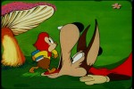
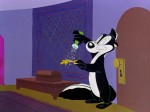
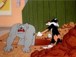
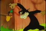
The images littering these posts are from two different releases compiling underrated 1940s and 1950s animation. The Warner cartoon images are taken from last month’s Looney Tunes Super Stars – Pepé Le Pew: Zee Best of Zee Best (from by Warner Home Video) and those from the Famous Studios cartoons are from the upcoming Noveltoons: Original Classics (from Steve Stanchfield’s Thunderbean Animation). Different source material (“Pepé” is from original negatives, “Noveltoons” is made up of mostly positive elements), highly similar and colorful results. So does this mean Steve is pumping his releases up to create candy-colors that never were? Kinda doubt it. Case closed.
(As a side note, I may be a bit biased in Steve’s favor. I loaned material for him to use, checked screener copies, and even provided audio commentary that I highly recommend you don’t listen to. But you should still buy it at any rate.)

I don’t handle film stock, or know anything about restoration, so I’ll take your word for it. I don’t think any of the major corporations who own these films are going to invest money to fix these problems. It also sounds like I should hang on to standard TVs for awhile longer.
It’s probable that something Warner is doing for the restorations is not jelling with either the limitations of DVD, or flatscreens.
Steve Worth is actually singing the praises of the Blu-Ray on the Animation Show and elsewhere. Maybe Blu-Ray just handles Technicolor better.
That forum is _still_ around?!
I handed lots of 16mm cartoon film elements in the 1980s (the un-golden age for seeing classic cartoons). Bad faded dupes, shitty salmon-hued TV prints, muted low-fade prints, and the occasional knock-out, super-sharp 35mm reduction.
Even then, I had seen enough good prints to know how these cartoons were intended to look. While I was grateful to get to see all the cartoons I did, via TV and 16mm prints, I realized that I was seeing only a miserable shadow of the real thing.
I feel that, for the most part, DVD releases of classic animation material serves its subject well. That said, yes–they do look hideous on those flat-screen TVs. It’s as if the flat-screens are encoded to make DVDs look bad, the better to push Blu-Ray player sales.
Between the obscenely pumped-up colors and the forced widescreen format that’s the default for most flat-screen TVs, it’s clear that this is not an ideal way to experience classic cartoons (or any older color film material).
Black and white seems to come across fine on a flat-screen. But it’s a pity that color, DVD-style, is such an issue. Something is truly lost in translation–or garbled into a neon monstrosity. I’m just enough of a cynic to think that this was deliberately set up by the makers of flat-screen TVs to usher in the Blu-Ray player as the default plug ‘n’ play media device.
Flatscreens are pre-configured with bright backlighting and color temperatures. If you get the chance, see if you can mess around with the video settings to get an improvement.
Blu-ray players also seem to have pre-configured settings that alter how the film looks on screen.
It took a while before I was able to successfully configure mine so I wouldn’t go blind whenever I put in a technicolor feature.
Thanks, I’ll keep that in mind once I make the leap. I may have to do it soon, because Blu-Ray is very much the equivalent of projected 35mm film. I saw Blu-Ray projected at a smaller theater last year and it looked better than their 35mm set-up. Made me cry a little…
Physical safety film is still my favorite way to watch the medium though.
As a newbie to the Flatscreen/HDTV/Blu-ray world, I for one have had no issues with playing the restored films on my flatscreen HDTV since I play the DVDs on my Blu-ray player. The picture is phenomenal!! It really depends on how you have your HDTV set for screen viewing. Most HDTVs don’t have S-video jacks which are on DVD players, so you have to use a regular video jack. WIth Blu-Ray you use an HDMI cable and it makes a HUGE difference.
I think once you get an HDTV and Blu-ray player of your own, Thad, you can make a proper assessment based on your personal viewing settings.
The other commenters are right – the factory settings of modern flatscreen TVs are awful. Pumped-up color saturation, sharpness is too high, and now, that awful frame-blending feature that creates the illusion of a higher framerate. Whenever I see anything with a 24fps framerate with this feature on, it gives me a migraine – and it’s hard to find the setting to turn it off.
Wonderful selection of stills for this post, man. I look forward to the Famous release.
I still use the older CRT technology myself. It just looks right, like film.
I have a super-fine pitch Sony for 16:9 movies. And then a 4:3 Sony with 1080i capability (although really it’s just a 480p set). Using a PC connected to a component input, I just recently watched some of the better quality Tom & Jerrys off the new Blu-ray set.
Even though it’s not reproducing the “true” resolution of the videos, it looks absolutely astounding. And not being a DVD, there’s no lossy compression artifacting. I don’t see any pixelization either. I can’t wait to see the Tex Avery MGM stuff at this quality, if they have it….
Also, try watching one of those Tom & Jerrys on an old Sony CRT multisync monitor that’ll do 1400 x 1050 or better. Your jaw will drop.