For some reason, whenever a release of newly restored Warner cartoons arrives, the restorations don’t excite me like those of the Golden Collections did in the, well, golden era of home video, 2003-08. Maybe it’s just me, but more often than not, the new restorations seem darker and less colorful than they used to. This began in 2010, when the Super Star titles were released, and a few cartoons looked like considerably less money was spent remastering them. The Looney Tunes Platinum Collection Volume Two, released today on Blu-Ray and standard DVD, continues this pattern.
In the case of the pre-1948 (formerly Turner, formerly United Artists, formerly A.A.P. package) titles, there’s no way they can get anything but better. What we had seen for years varied wildly, depending on the condition of the 35mm positive prints struck in the 1950s for television. When they uncover something truly historic, as in the original ending of the first Bugs Bunny cartoon Hare-Um Scare-Um that was cut for general exhibition almost three quarters of a century ago, it’s worth $20 to $30 just for that alone.
When a newly restored post-1948 short turns up, oftentimes they look much darker than I’m used to. The contrast looks completely off, and the subtleties of the background styling (particularly the lighting) are far too muddy.
The cartoons of the first Golden Collection volume were not remastered in high-definition, therefore new masters had to be made for this release. Elmer’s Candid Camera, Wabbit Twouble, Bugs Bunny Gets the Boid, Long-Haired Hare, and Rabbit, Fire all look practically identical to the earlier 2003 release. On three others, however, it looks as though they used inferior material.
The acid test – compare the older versions to the new re-masters.

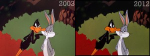
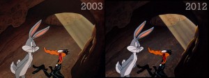
This seems to be the same dilemma as last year’s Tom & Jerry release, on a much smaller scale. No, I don’t think either version is perfect. The 2003 versions’ colors tend to be far too neutral, even bleached, but the picture is far clearer and sharper. This was WB’s first major animation release, after all, and the title selection was made from a pre-determined list.
Now in 2012, the kind of detail we appreciated in the Golden Collection years is muddled. In the case of Canned Feud, one of the finest comedies ever made, its original titles were reinstated (you can see on the WB Classic Animation Facebook page a video of their ‘process’, where you can clearly see the splice where they made the cut in the titles for the reissue), but now the beautiful work of Hawley Pratt and Paul Julian has been compromised.
What is most interesting is that one of those premiere volume titles from 2003, Deduce You Say, looks considerably better in its latest edition. The color is unquestionably richer.
I’m sure one of the Internet ‘experts’, the same ones who chided me last year for daring to suggest I knew more than them about the Tom & Jerry situation, will declare boldly that the newer HD version is superior and place blind faith in Warner Home Video. Regarding the T&J release, superior elements on those offending titles were available, and they just simply weren’t used.
With the WB cartoons, it obviously isn’t self-sabotage/willful ignorance. What is apparent is that WHV has new policies in place in the restoration department, ones with varying dependability and far less funds at their disposal. Thanks to the dictatorship of former President Dick Cheney and his puppet George W. Bush, there’s a lot less money for non-essentials these days. Perfect Looney Tunes restoration is probably the least of the average person’s worries. There’s nothing warranting a true cry of foul yet (like the abhorrent ‘widescreen’ versions they’ve thankfully killed off). At least they’re not using faded Eastmans or truly horrid material. And when it comes down to it, I think we can all agree that most of the best and important Warner films have gotten the royal treatment on home video already. I mean, does anyone really care if A Horse Fly Fleas looks perfect? (Actually, the original titles reinstated for that cartoon have serious image bleeding, looking as though they sourced a 16mm Cinecolor print. Warms my heart.)


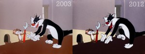
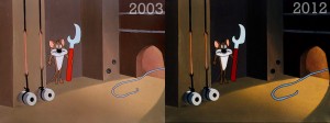
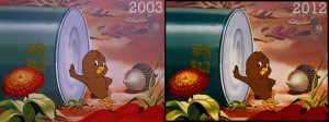


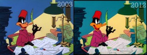
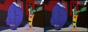
“Deduce” has probably set the record for inconsistent prints. The syndicated film copies struck by Warners in 1964 were pretty good, even if some of the stations playing the post-48 shorts telecines and broadcasting equipment left something to be desired (and each individual station could mess up their own neg over the years as they chose — Ch. 5 in New York cut the entire section from reading the note to Daffy entering the pub out of their version. The print color looked good, but damn, was that a short cartoon).
Once we get into the electronic image era, the quality just bounces up and down — the initial videotape dubs around 1980 were good, the one for the 1985 WHV Golden Jubilee Collection had some oddball zoom in on the closing titles, and the 1998 print sent out for domestic use had it’s issues as well (turn down the contrast, guys). You’d think the 2003 DVD re-do would have ended the problem — unlike some of the LTGC Vol. 1 releases like “Kit for Cat”, “High-Diving Hare” or “Early to Bet”, it needed no re-tinkering. But just like Cartoon Network seemed to accept whatever crap print Burbank sent them to run 14 years ago, the quality control on the final product even in the HD era can’t be assured, for whatever reason.
It occured to me that this just might be intentional. One of the biggest complaints about the Golden Collections from hardcore cartoon buffs was that WB was pumping up the colors too much, making them look garish and overly bright.
Toning down the colors might be an attempt to address that.
Sounds shite.
Looks like we need a new feckin’ set with more feckin’ cartoons restored that we haven’t seen. What’s the miss of that feckin’ Platinum Collection?
In a bizarre twist of fate, I ended up buying a Blu-Ray player, and this set. I’m impressed. The cartoons DO look better. There is a certain “glow” to them that makes them look as if I’m watching them on real film. I didn’t think they could ever improve on the DVD versions, but they did.
“Rabbit Seasoning” actually looks better on the new LTPC, IMO, but it looks like the image is more sharpened in the 2003 restoration. “Canned Feud” definitely looks better in 2003, even though those restorations look too bright for me.
To me, the best color tone would be something bettween the 2004-2011 and these new restorations. But, those are just shades, you can never please anyone 100%. The only thing that really stands out in the “Mouse…” collection (don’t have the Platinum yet) are the prints with original titles. They are too dark, the difference bettween the main body of the cartoon and the opening (they used the closing titles from original prints, as well…) titles is obvious, and it hasn’t been that in previous releases.
You know, all in all, I have only one complaint about the supposedly restored contents of the second PLATINUM COLLECTION set–“RABBIT FIRE”, the first of the duck season/rabbit season Bugs/Daffy/Elmer trilogy is *STILL recorded/played at a slightly slower pitch. I was really disappointed in that because I thought that, since “CANNED FEUD” had its earlier flaw fixed, all other such errors would have been corrected. Otherwise, I enjoyed all the cartoons, even the double and triple-dip titles, and this one had some nice segues and representations of the main characters, especially in the DAFFY DUCK section of the first disk. Nice job overall, but I beg only more quality control of Warner Brothers. After all, the reason for the blu-ray format is to give us a finer representation of the film as it appeared in theaters. Here’s to the continuation of the series and to a possible VOL. 3.
It wouldn’t surprise me if WB doesn’t have the money for restorations it used to. I received the Porky Pig Super-Stars set today and it had a dubbed cartoon (“One Meat Brawl”). And a few other cartoons on it (such as “Riff Raffy Daffy”) definitely didn’t look as high of quality as we saw with the first couple Golden Collections. This line was supposed to have all restored cartoons (not to mention all new-to-DVD cartoons), so it’s a shame that’s not the case anymore.
“It occured to me that this just might be intentional. One of the biggest complaints about the Golden Collections from hardcore cartoon buffs was that WB was pumping up the colors too much, making them look garish and overly bright.”
That that was happening should be abundantly obvious to anyone who has ever watched a pre-2000 restoration of those cartoons. Actually, forget looking for VHS, just use Steve Schneider’s “That’s All, Folks!” book, with its full-colour reprints of backgrounds throughout. And if you still can’t see a problem, you don’t exactly have a right to complain…
The problem is, a lot could happen in the process of making an animated cartoon in the Golden Age. Cels and backgrounds were painted to get different effects on film. How a cartoon looks on safety film (which is what was used for every Warner cartoon release prior to 2000) struck years after the fact could be radically different from the original nitrate element. Hell, the color in original release prints could vary. The telecine process has also made a huge leap forward in the digital era, so the VHS tapes aren’t exactly a good yardstick. (Though it’s a problem when the older VHS tapes are undeniably more colorful, as is the case with RABBIT SEASONING and THE FOGHORN LEGHORN seen here, and many of the cartoons on the new Porky Pig release.)
I saw a post from someone who had complained about the Golden Collection restorations forever. He said that the first Blu-Ray Looney Tunes set was the best those cartoons ever looked… but aside from being presented in full 1080i resolution, they are THE EXACT SAME TRANSFERS AS BEFORE!! The very same everyone says are too bright! The case against the GC restorations is bullshit. I don’t think every cartoon is perfect, but they are as close an approximation as possible to how they originally looked. This is not the same as the Disney Studio releasing its features with a different color scheme every time it “comes out of the vault.”
Thanks for this, Thad! Great to see somebody putting some real effort into analyzing these toons against the DVDs with screenshot comparisons instead of just your standards written review.
I’m curious about your thoughts on the title cards for RABBIT SEASONING and CANNED FEUD on the Platinum Collection vs those on the Golden Collection. The CANNED FEUD title card on the PC is vastly different than that on the GC. On the GC, the background is purple hued and the letters are yellow. But on the PC, the lettering is white and the coloring in general seems washed out leaving me to wonder which one is correct. Any idea?
Similarly, the titlecard for RABBIT SEASONING has also changed. On the PC, the background color is blue! I’ve seem this cartoon a hundred times between TV, VHS, and DVD and the background color has always been green. Which is correct?
I would have to say whatever predated the Blu-Ray/DVD release is more accurate, sadly. For the record, it seems the new restorations have effectively taken a nosedive after the Pepè Le Pew DVD. The new cartoons on Platinum Vol. 2, Porky Pig, and Hippety Hopper could all use some longer sessions in the telecine lab, but what can you do? There’s literally zero money in that department now.